We finally had a chance to read
Thirteenth Child, the first in Patricia Wrede's "Frontier Magic" series. For some books, the author's name is enough to sell it: Patricia Wrede = magic and adventure with great character development = automatic library buy. Still, we're not sure about the cover:
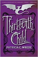 |
| paperback |
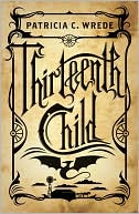 |
| hardcover |
It's nice, but a bit understated (which isn't necessarily a bad thing). For someone who is already a fan of Wrede, or who already likes the genre, it may be just right. We can't see it catching the eye of someone who is just browsing, though. The sequel, on the other hand:
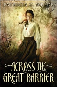 |
| coming this August |
Ooh - we want this book! Fantastic colors, perfect font, and a girl-slash-woman who looks a little bit scary, a little bit scared, but definitely like someone you don't want to mess around with or underestimate. Yep, perfect cover, guys! Now for the dilemma...do we move the series to YA, or leave it in JF? That's the problem with series where the main character grows up on us. Wherever it lands, we get this one first!


Funny how it's all so subjective, isn't it? I quite prefer the graphics and the deep purple of the paperback cover and I've never been able to quite embrace covers with photorealistic people on them, especially when their face is completely shown.
ReplyDelete